Up & Go
What we did
Creative strategy
Identity design
Logo design and branding
A brand strategy and graphic identity to help worker cooperatives expand with new technology
-
Project Brief
Center for Family Life in Sunset Park (CFL), a program of SCO Family of Services, is a neighborhood-based family and social services organization based in Sunset Park, a low-income neighborhood in Brooklyn. CFL helps children, adults, and families succeed by partnering with the community to provide access to resources and opportunities for personal growth. Through these comprehensive programs, neighborhood residents develop interpersonal relationships, which nurture families, builds confidence in youths, and enriches the overall quality of life.
CFL has been working closely with worker cooperatives for the past decade. In recent years, they recognized the opportunity to help worker cooperatives expand with new technology. Partnering with CoLab Cooperative, Robin Hood Foundation, Barclays, and the New York City Work Cooperatives, CFL coordinated the development of Up & Go, an app that allows consumers to easily book professional house cleaning services from businesses with fair work practices.
CFL needed a brand that clearly portrays the platform’s philosophy and values. We provided CFL with the brand strategy, naming, and graphic identity design.
Approach
Alfalfa Studio approached the assignment in three phases: Brand strategy, naming, and visual brand identity.
During the brand strategy phase, Alfalfa Studio helped CFL understand their consumers, competition, category, and company. During this phase, we also explored key themes, insights & implications to get us to a strategic brand positioning. The result was a brand positioning, messaging strategy, and consumer journey.
With a clear brand strategy on hand, we set out to develop a name that communicated its unique value in a way that was understandable and memorable. After reviewing five creative territories with over 500 different names, and getting in-house feedback from the worker cooperatives and CFL’s partners, we decided on Up & Go.
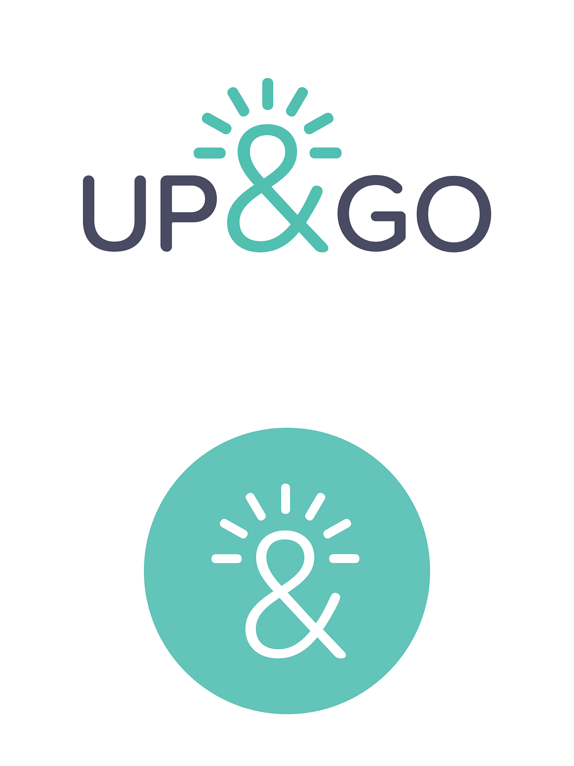
Last, Alfalfa Studio’s core design team brought CFL’s vision to life. Through intensive research, iterations, analysis, and dialogue, we designed a logo that captured Up & Goes’s core essence. First, the logo’s flexibility makes it functional as it works in every size and medium. The logo is memorable because it is distinguished from its competitors through the use of colors and form. The radiant strokes over the ampersand signify a positivity that is relatable and uplifting. The logo embodies empowerment, quality, and community.
Outcome
Alfalfa Studio delivered a complete branding for Up & Go, including logotype, symbol, color palette, typography, applications, and brand guidelines. The simplicity of the logo works in various levels and speaks to Up & Go many constituents: Clients, coop workers, and stockholders. Graphically, it evokes transparency, brightness, cleanness, fairness.
“We are so excited for the world to see the beautiful brand you helped build. This is a truly collaborative project, and your team was a fundamental part of this.”
—Sylvia Morse, SCO Family of Services, Center for Family Life
The new brand identity has been welcomed from members of the worker cooperative and CFL’s partners. The members of the worker cooperatives felt connected to the logo because they were a part of the process from beginning to end. The positivity of the logo exemplified their mission as business owners.


