New York City Football Club
What we did
Creative strategy
Identity design
Logo design and branding
The design of the most popular soccer team badge in the Major League Soccer
-
Project Brief
This was a watershed moment for New York: the time when the city—all five boroughs of it—got its own major league football club. Alfalfa Studio is pleased to present the badge we created for the newly minted New York City Football Club.
As a proud New Yorker, Rafael Esquer’s was determined to represent New York City as a strong, bold, collaborative community deeply rooted in and proud of its history. His direction to Alfalfa Studio: position the NYCFC’s badge as a genuine, authentic and timeless football badge—very NYC and, at the same time, with a presence to stand on its own in international contexts.
The Goal
In our proposed NYCFC badge, we placed emphasis on four key qualities: simplicity, legibility, memorability, and timelessness.
In his article “NYCFC Seeking One Badge to Rule Them All,” Soccer News Day writer Nick Chavez best explains our creative goals with the design of the NYC FC badge: “…there’s a thin line between making something “New York,” and making it the same old run-of-the-mill Statue of Liberty and Empire State Building-laden images that have been done again and again. There has to be a certain classy style to the crest. One that combines the modern with the historic, creating an image of optimism and ambition, while also exhibiting pride in the considerable history and global relevance of the world’s most iconic city.”
Methodology
Inspiration for our NYC badge came from the rich graphic vocabulary that is so much a part of the boroughs of New York. Urban landmarks such as subway stations, theater marquees, industrial sites, and old store signage evoke the everyday life of the city. And urban artifacts such as manhole covers, the classic subway token, architectural details, vernacular typography, and historic photos and advertisements echo its rhythms.
Our research included the study of New York City symbols, landmarks and competitive sports teams. We studied heraldry, badges, coat of arms, New York City history—starting with the Native American cultures that lived in New York City for millennia—and the universal meaning of symbols. Since it was very important that the NYCFC badge stood on its own in international contexts as a genuine, authentic, and timeless football badge, we also looked at badges from around the world.
We paid special attention to the design of a fresh and unique monogram. Conceptually, the intertwining of the N, Y and C alludes to teamwork, strategy, harmony, and unity. The letterforms were custom-drawn to achieve the necessary level of geometry and balance.
We focused on every detail, proportions, and the actual and perceived relationships between each of the elements used.
“I am not even a fan of NYCFC, but I would definitely buy that.”
—Soccer enthusiast on Bigsoccer
Challenges
When thinking of New York City, most people equate it with Manhattan but this long, narrow island is only one of the city’s boroughs. It was imperative that the NYCFC badge represented all five boroughs, devoid of any hierarchy. The client’s directive was clear: five boroughs, one city.
In addition, while exuding a definite NYC character, the badge had to have the presence to stand on its own in international contexts.
Lastly, NYCFC now has a badge, but only its Sporting Director and Head Coach have been identified, no players yet! Winning fans—the heart and soul of any sports team—solely on the promise of success was no small feat, particularly when competing for loyalty against teams with long legacies.
Results
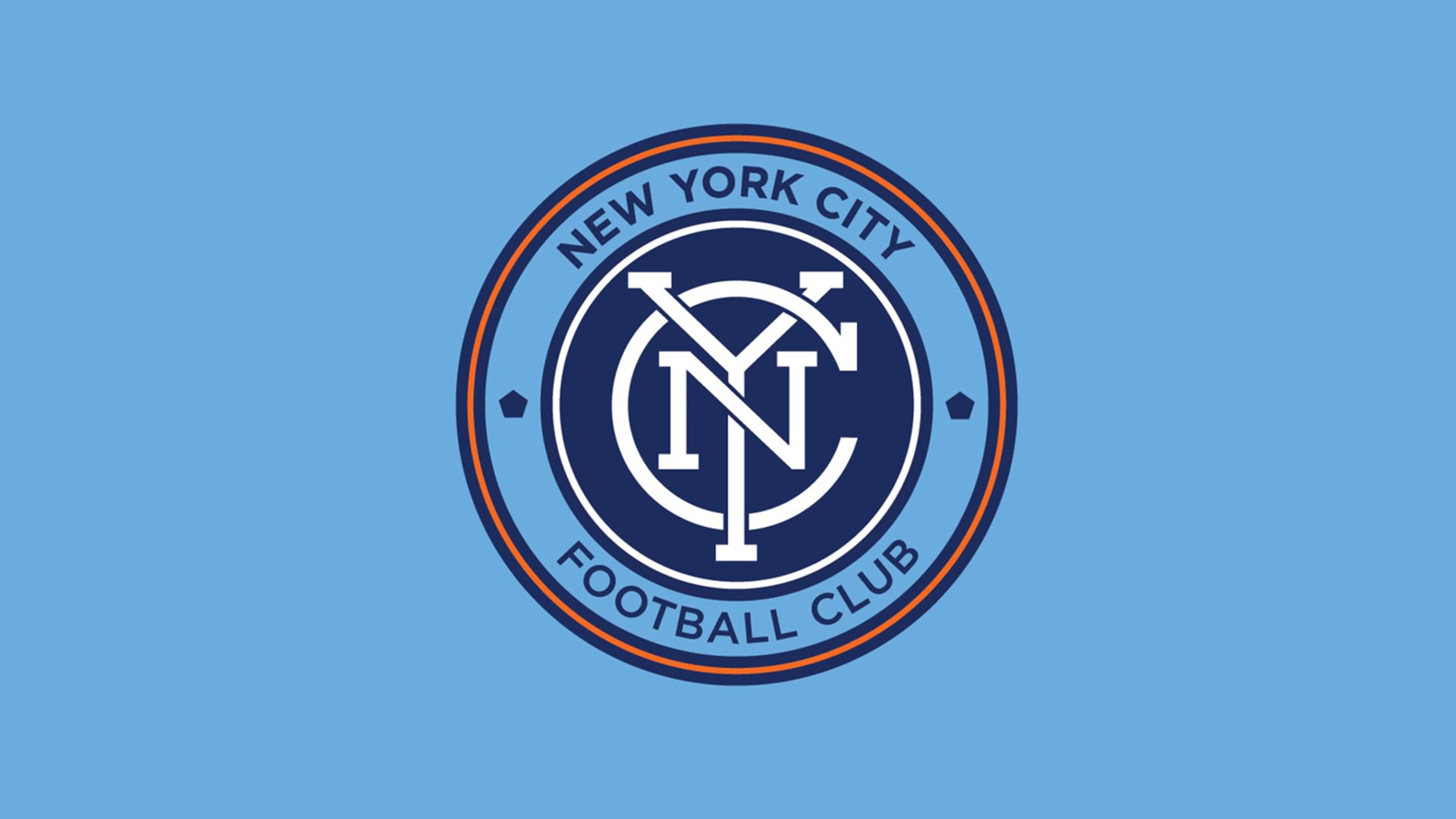
The final badge presents a timeless monogram inside of a circle. The shape is inspired by the old New York City Subway Token, created by the Transit Authority in 1953 and used for 50 years as the standard fare for a ride. The last version of the token had a cut out pentagon in the center representing the five boroughs, similar to what appears on either side of the monogram, to reinforce the Club’s connection to entire city. The circle is also a symbol of unity, wholeness and infinity, and is often associated with potential and the number one. This is a modern and confident badge that clearly speaks to New York City’s status as a leading city.
The badge features the typeface Gotham, a wholly American font inspired by the City’s signage. Born out of an in-depth study of building lettering in New York City, the monogram reflects the rich graphic language that is so much a signature of the five boroughs.
The colors navy blue, white and orange are drawn from the New York City flag, while the light blue refers to the club’s family lineage, Manchester City FC.
From our research, we synthesized a fresh graphic style that we then integrated within a circle. Together, they evoke a powerful New York City “seal of quality”—a badge intended to be worn with honor and pride.
Beyond Results
New York City FC unveiled its official team badge with approximately one year to go before kicking off its inaugural season in March 2015. From two potential badges—both designed by Alfalfa Studio—fans cast their vote and selected the definitive one in an online, public poll. Over the course of four days, more than 120,000 votes were cast, deciding the badge that has now become the bedrock of the club’s identity and a focal point of all team gear and merchandise.
“Both choices are uniquely-classic looking images, especially compared to most MLS badges, reminiscent of some of the old, legendary crests of the world’s greatest and most famous clubs.”
—Nick Chavez, Soccer Newsday
“Given the significance of a Club’s badge and what it means for a team’s identity, it was important for us to have our fans included from the beginning—a commitment that we’ve made from the start,” said Claudio Reyna, Sporting Director of New York City FC. “Thanks to the voice of our fans, we feel that we have a design that truly represents our Club and our City.”
Sports fans are very vocal and highly opinionated about anything related to their team; the badge, of course, was no exception. Thorough research, professional craftsmanship and business acumen paid off, though: the badge was ‘love at first sight’ for a great majority, as expressed in the fan comments below:
“NYCFC have gone with a quality option that may well be the class of Major League Soccer come First Kick 2015.”
—Mark Yesilevskiy for SB Nation
“@rafaelesquer thank you for bringing us a beautiful badge design! We are Made in NY.”
—City Soccer
“Once the badge came out, I was struck by the interlocking NYC. It felt timeless to me—bigger than just a soccer team. In my opinion, it will become as synonymous with NY soccer as the interlocking NY of the Yankees is to baseball in the city and the US.”
—The Third Rail supporter and NYC FC fan
“Instant classic. Smart move.”
—Adam J., St. Paul, Minn. soccer fan
“Are the two NYC FC badges already the best in MLS? So where does this leave NYCFC? As they work towards 2015, they’re relying on fans to tell them which path to take. Unique and classic, or just classic? It’s an open question, since neither of the two badges will remind anyone of the bad old days of MLS design or even the follow along era of re-branding.”
—J Hutcherson, U.S. National Soccer Players
One year after launching the new team and badge, NYC FC ranks #3 as the most valuable team in the MLS with a team value of $255 million and a 2015 revenue of $36 million according to Forbes Magazine.
Support for the team has grown exponentially since launching their badge, as shown in the increase of fans in social media channels. NYC FC is the most popular MLS team in social media with over 3.5 million followers from Twitter, Facebook and Instagram.
Sales of merchandise have skyrocketed. In their home-opener game NYC FC set a record for single-game in-stadium merchandise sales. The highest in the 20-year history of Major League Soccer!


